
The Map Projections Lab is an interactive data visualization that demonstrates how map projections distort geometrical shapes depending on their coordinates. What starts with a trivial geometrical issue, representing real objects on a two-dimensional surface, can reveal a more conceptual and political statement. The project addresses the fundamental representation challenge in cartography while providing a tool for further questioning regarding historical conventions and how a geometrical decision can imply an international imbalance.
Each one of the several projections that exists consider a trade-off between preserving distance, area, shape, and combinations of them. By allowing users to manipulate the same shape, Brazil boundaries, across different projections on the fly, the visualization helps these abstract distortions to be more tangible and comparable.
Each one of the several projections that exists consider a trade-off between preserving distance, area, shape, and combinations of them. By allowing users to manipulate the same shape, Brazil boundaries, across different projections on the fly, the visualization helps these abstract distortions to be more tangible and comparable.
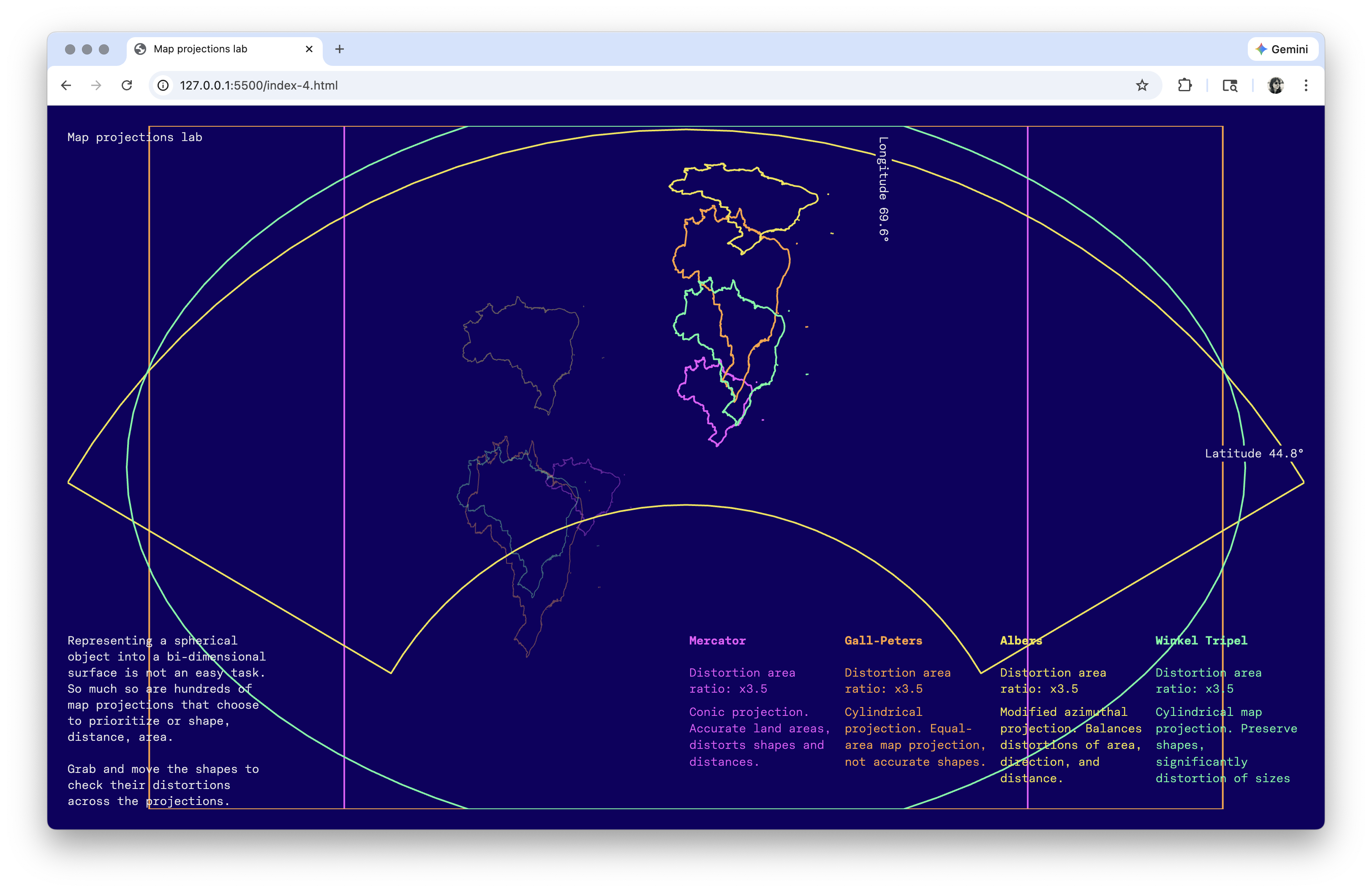
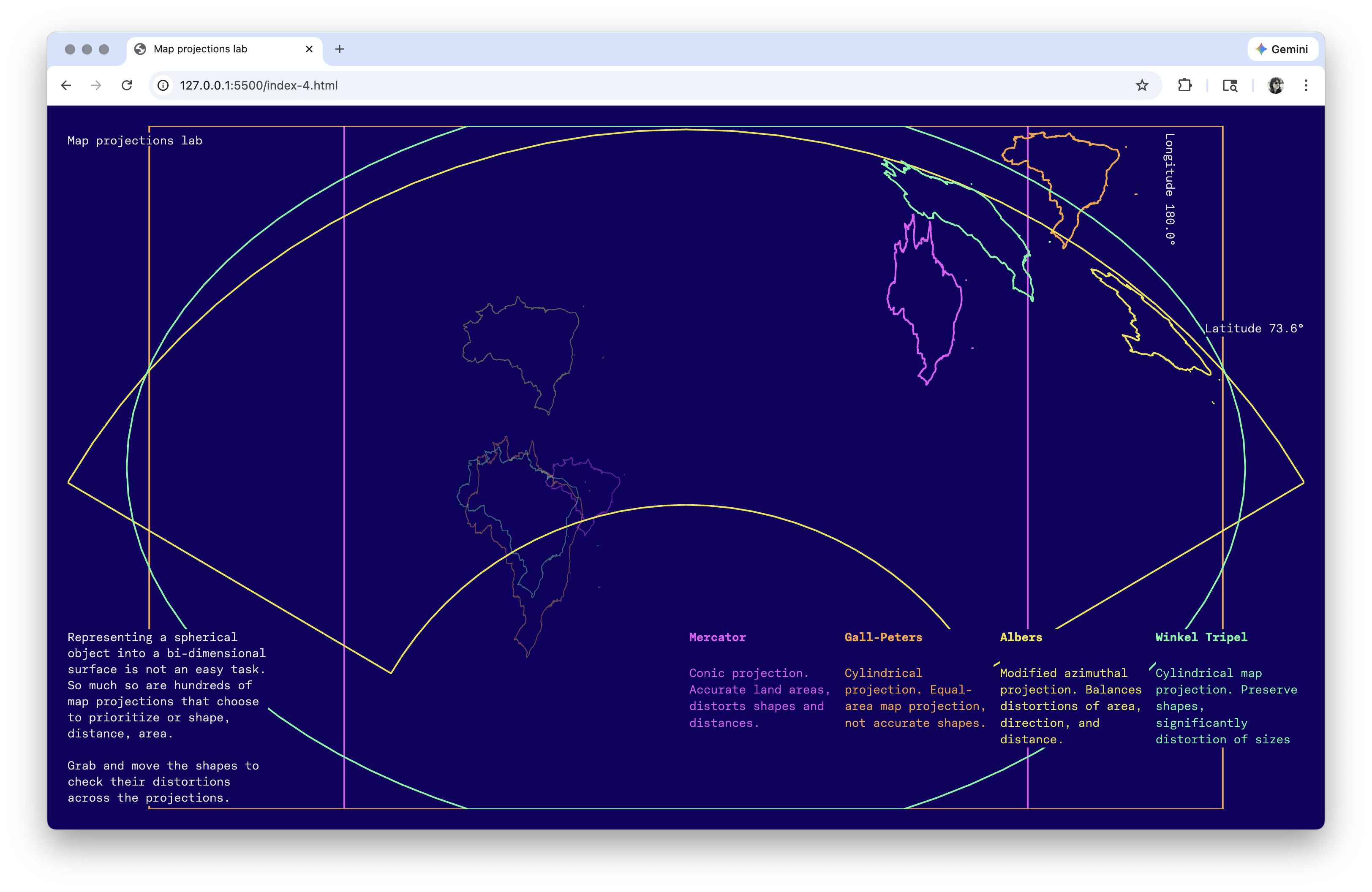
The final implementation centers on two key interactions. First, users can drag shapes both vertically (latitude) and horizontally (longitude) to observe on the fly distortion changes. As shapes move across the coordinate system, their forms transform according to each projection's mathematical logic. To reinforce the idea of grabbing the shape to shift it around the projection surface, dynamic latitude and longitude labels were added,following the cursor.
Second, the outline representation and multiply blend mode allow all four projections to overlay simultaneously, creating a visual comparison where differences in shape and position become immediately apparent through color interactions.
Second, the outline representation and multiply blend mode allow all four projections to overlay simultaneously, creating a visual comparison where differences in shape and position become immediately apparent through color interactions.
The project is built basically with D3.js, adopted for either its extensive possibilities to manipulate elements in a map or allow a high level of customization and layout responsiveness. Each projection uses D3's built-in geographic projection methods with manual calibration for each specificity. For instance, the Albers projection uses standard parallels at -5° and -35°
to optimize the representation
of Brazil's geographic extent.
The dragging mechanism transforms the user's mouse movements into coordinate instructions. This creates the illusion of moving shapes across the globe while actually shifting their coordinate values.
The layout was built using CSS grid with a 24-column system, providing precise control over element positioning. The page uses a fixed viewport approach with calculated heights to ensure the responsive visualization, shifting the limits for any screen dimensions, either width or height. A custom crosshair cursor, implemented as a 64×64px SVG, reinforces the coordinate-based interaction model. The dataset used in the project was the geometrical file itself, a .geojson file containing Brazil's country boundaries.
to optimize the representation
of Brazil's geographic extent.
The dragging mechanism transforms the user's mouse movements into coordinate instructions. This creates the illusion of moving shapes across the globe while actually shifting their coordinate values.
The layout was built using CSS grid with a 24-column system, providing precise control over element positioning. The page uses a fixed viewport approach with calculated heights to ensure the responsive visualization, shifting the limits for any screen dimensions, either width or height. A custom crosshair cursor, implemented as a 64×64px SVG, reinforces the coordinate-based interaction model. The dataset used in the project was the geometrical file itself, a .geojson file containing Brazil's country boundaries.