
Most gentrification research zooms in on a handful of largely studied cities, such as New York City or Los Angeles. John Lauermann's Lab Group's research approached the theme from another perspective, seeking patterns of gentrification across the country by defining an index to measure a tract's intensity of gentrification. It was built from open Census data and applied across more than 800 metropolitan and micropolitan areas, tracking neighborhood class upgrading across two time periods, 1970–2020 and 1990–2020.
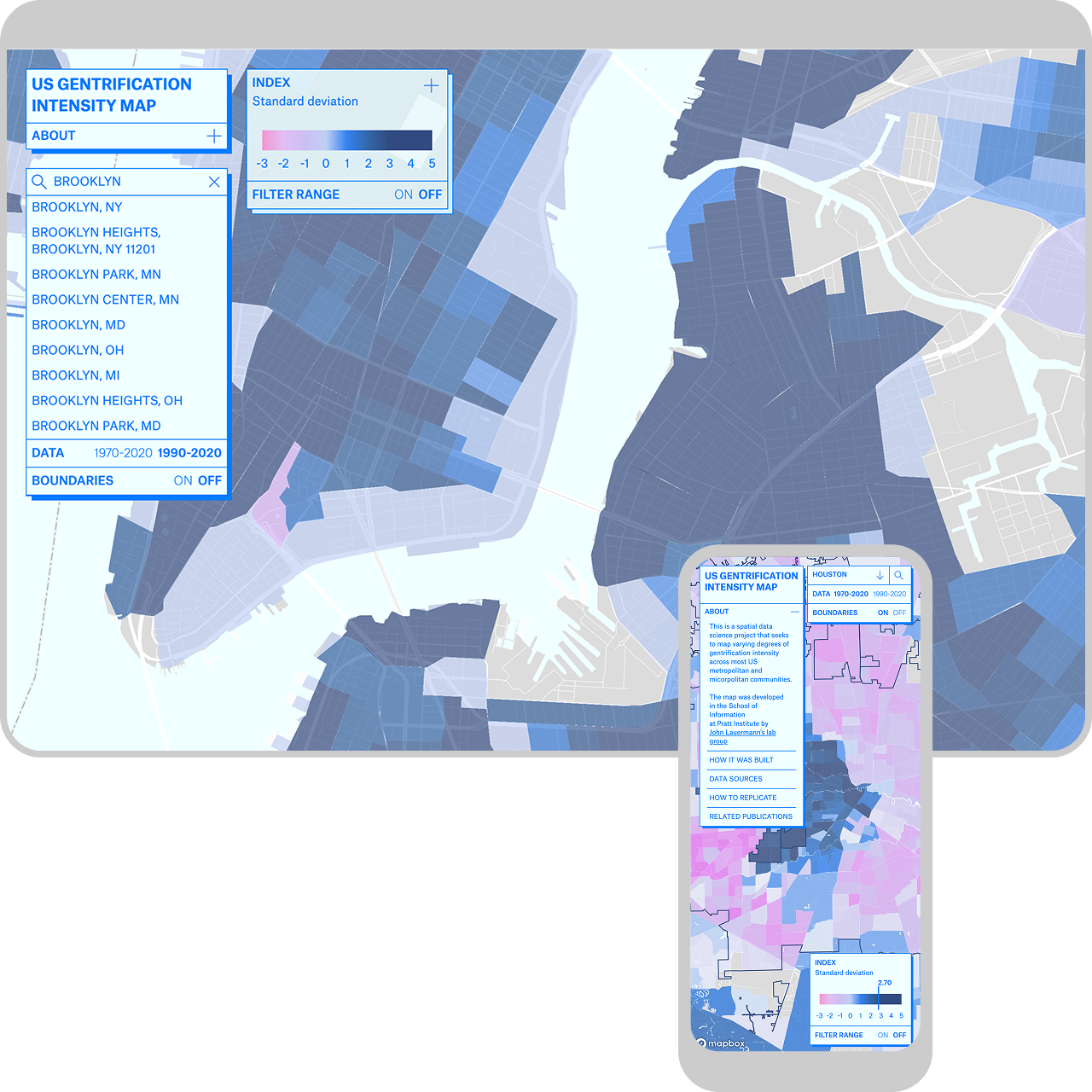
My contribution to this research was to give the index a public face by designing and developing an interactive map, letting anyone look up their own neighborhood and see whether, when, and how intensely it gentrified. The interface had to work for two very different kinds of users: a general audience who just wants to find their neighborhood, and a research audience who wants to interrogate the underlying data and eventually adopt the index as a basis for their own research.
My contribution to this research was to give the index a public face by designing and developing an interactive map, letting anyone look up their own neighborhood and see whether, when, and how intensely it gentrified. The interface had to work for two very different kinds of users: a general audience who just wants to find their neighborhood, and a research audience who wants to interrogate the underlying data and eventually adopt the index as a basis for their own research.
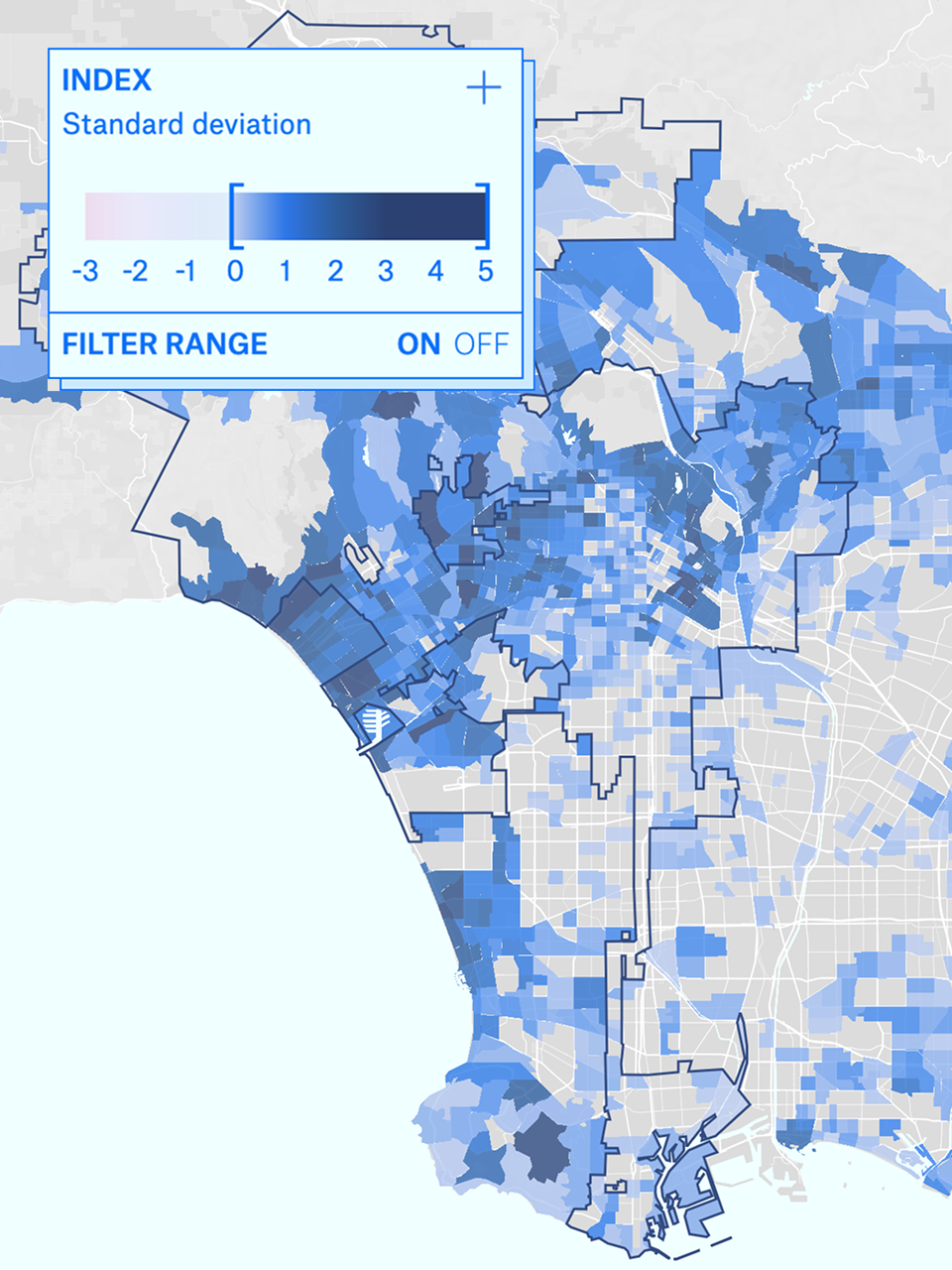
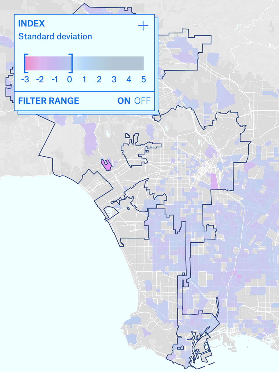
The gentrification intensity index is a continuous score that ranges from negative values to gentrified and super-gentrified classifications. To make that gradient explorable rather than just color-coded, it was built with a draggable range filter: two bracket handles on a slider that let users narrow the map to tracts within a chosen intensity band.
Dragging the handles updates the map in real time, so the map redraws as you narrow the range, useful for a researcher isolating the most intensely gentrified tracts nationally, and just as useful for someone trying to see whether their own neighborhood's change was dramatic or barely above the CBSA average. Switching from one period range to another keeps the map framing and selection consistent, so one can clearly compare differences between periods.
Dragging the handles updates the map in real time, so the map redraws as you narrow the range, useful for a researcher isolating the most intensely gentrified tracts nationally, and just as useful for someone trying to see whether their own neighborhood's change was dramatic or barely above the CBSA average. Switching from one period range to another keeps the map framing and selection consistent, so one can clearly compare differences between periods.
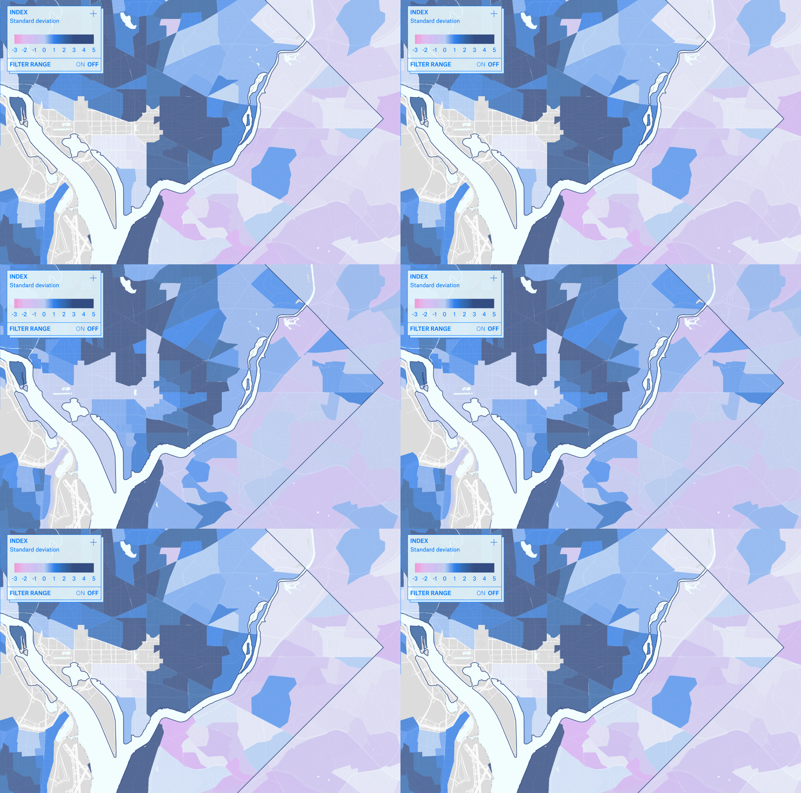
The dashboard runs on two parallel datasets, a primary index from 1990–2020, and a longer, less complete historical index reaching back to 1970. The two periods vary in levels of confidence in the same underlying question. The map allows users to toggle between the two time windows and watch the same census tract's story lengthen.
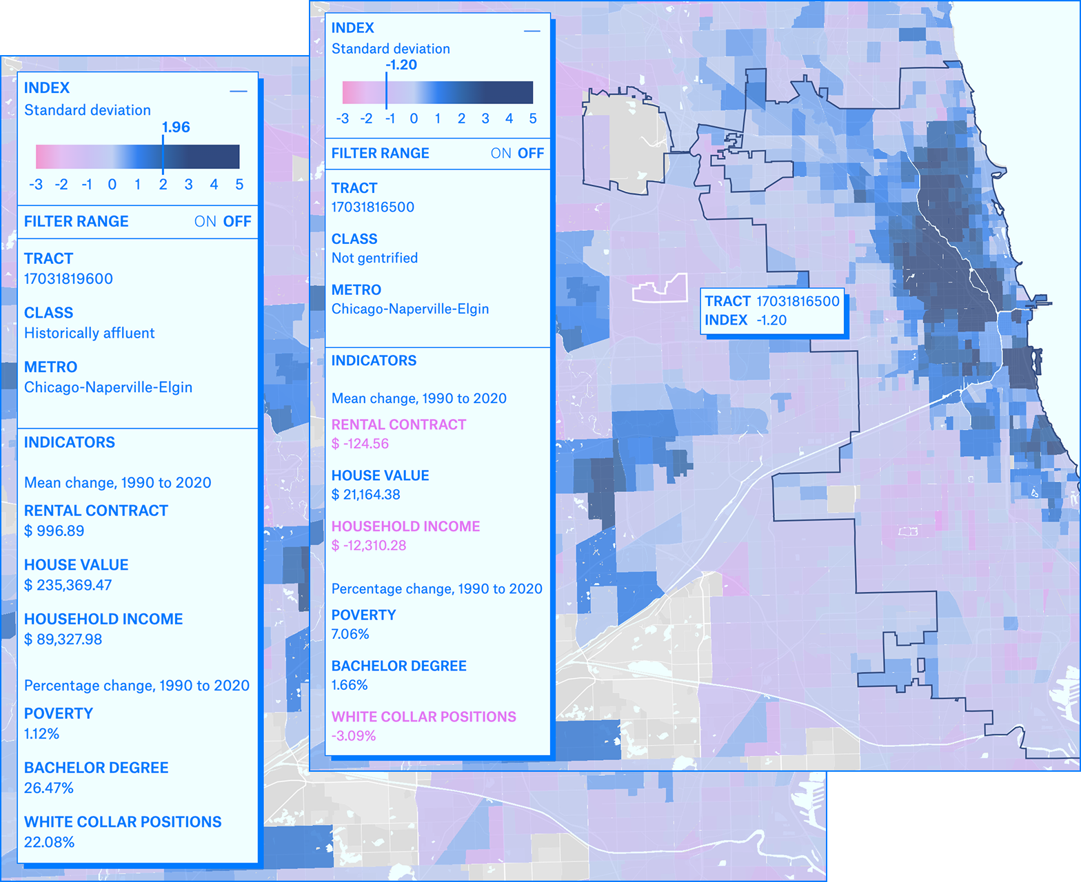
The index itself is built from six components: household income, poverty rate, house value, contract rent, share of adults with a bachelor's degree or higher, and share of white-collar employment. The six components are combined into a single score, which is then benchmarked against its own metro region rather than a national average, that's what makes the index meaningful.
Clicking or hovering a tract opens a detail view breaking the score back down into those six underlying indicators, alongside the CBSA it belongs to. The goal was to let the map work at two zoom levels of understanding at once: a color gradient for pattern-spotting across a whole region, and a per-tract readout for anyone who wants to know why a specific place scored the way it did.
Clicking or hovering a tract opens a detail view breaking the score back down into those six underlying indicators, alongside the CBSA it belongs to. The goal was to let the map work at two zoom levels of understanding at once: a color gradient for pattern-spotting across a whole region, and a per-tract readout for anyone who wants to know why a specific place scored the way it did.
How the index was defined is documented in a peer-reviewed paper I co-authored, where I designed the data visualizations. The GitHub repository documents the dashboard's build with a readme, letting other researchers access and replicate the dataset. Finally, learn more at the School of Information website.