The project is a collection of data visualizations about the environmental costs of 50 protein-rich foods. It aims to graphically relate data from foods' nutrients of animal, dairy, and plant-based protein sources with their impact, measuring greenhouse gas emissions, wasted water, and land use in the production.
Today, the search for protein-rich foods is a staple in fitness and muscle-building diets. But what else are we consuming alongside these proteins? The following charts can assist us in making a more holistic decision about our food choices by measuring nutritional qualities beyond protein, including fiber, calories, fats (lipids), and cholesterol, as well as their environmental production costs, such as carbon footprint, land use, and water consumption.
Today, the search for protein-rich foods is a staple in fitness and muscle-building diets. But what else are we consuming alongside these proteins? The following charts can assist us in making a more holistic decision about our food choices by measuring nutritional qualities beyond protein, including fiber, calories, fats (lipids), and cholesterol, as well as their environmental production costs, such as carbon footprint, land use, and water consumption.
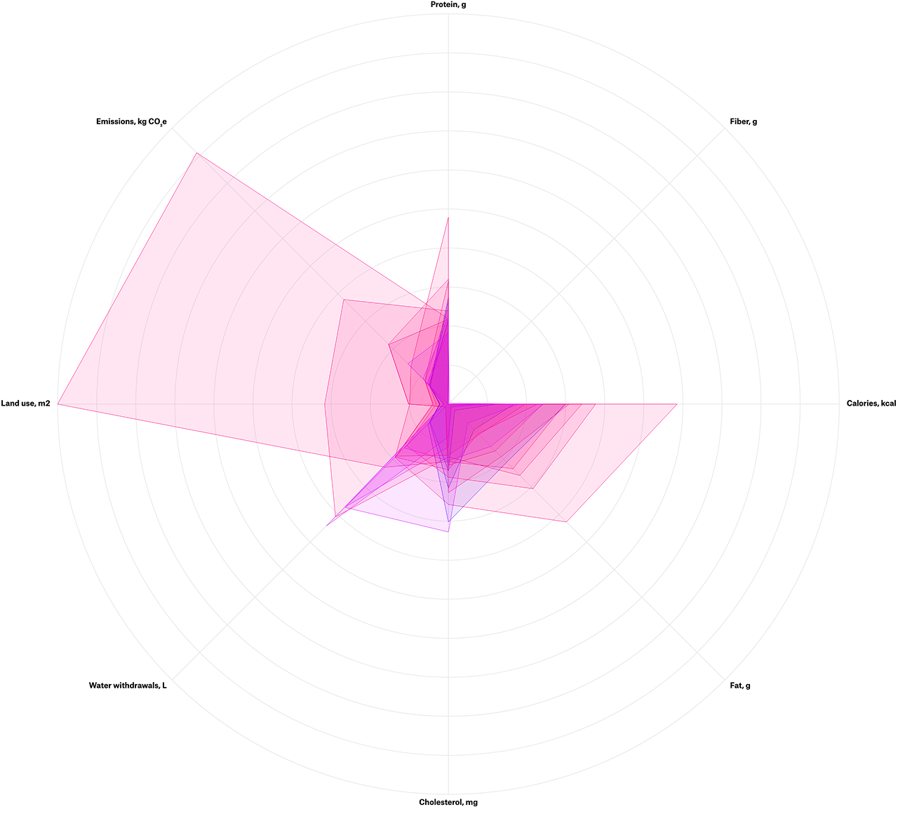
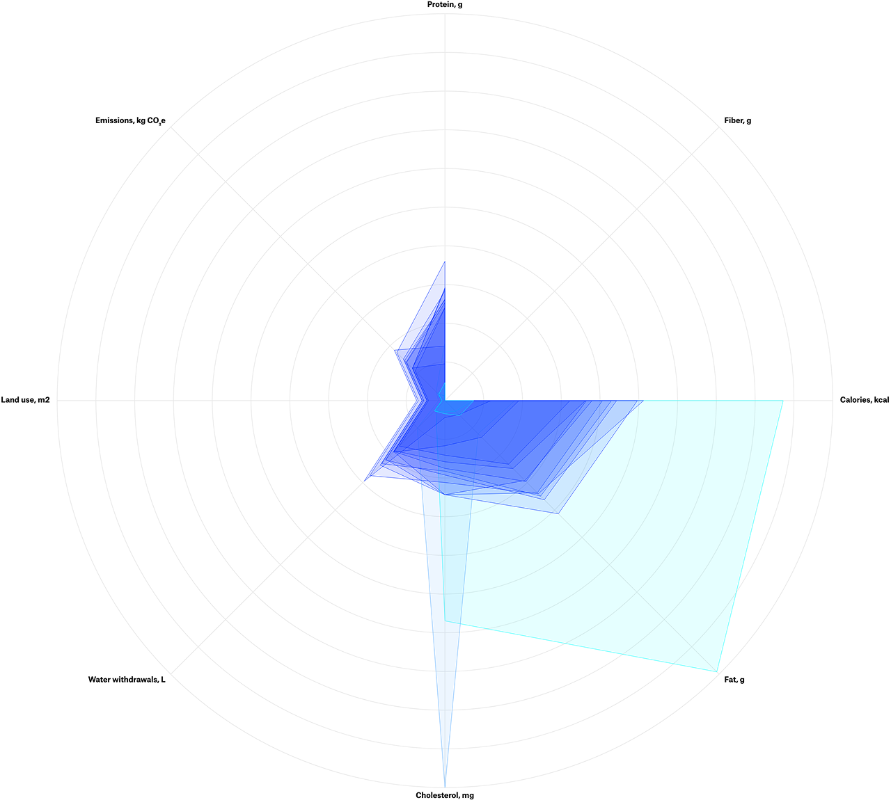
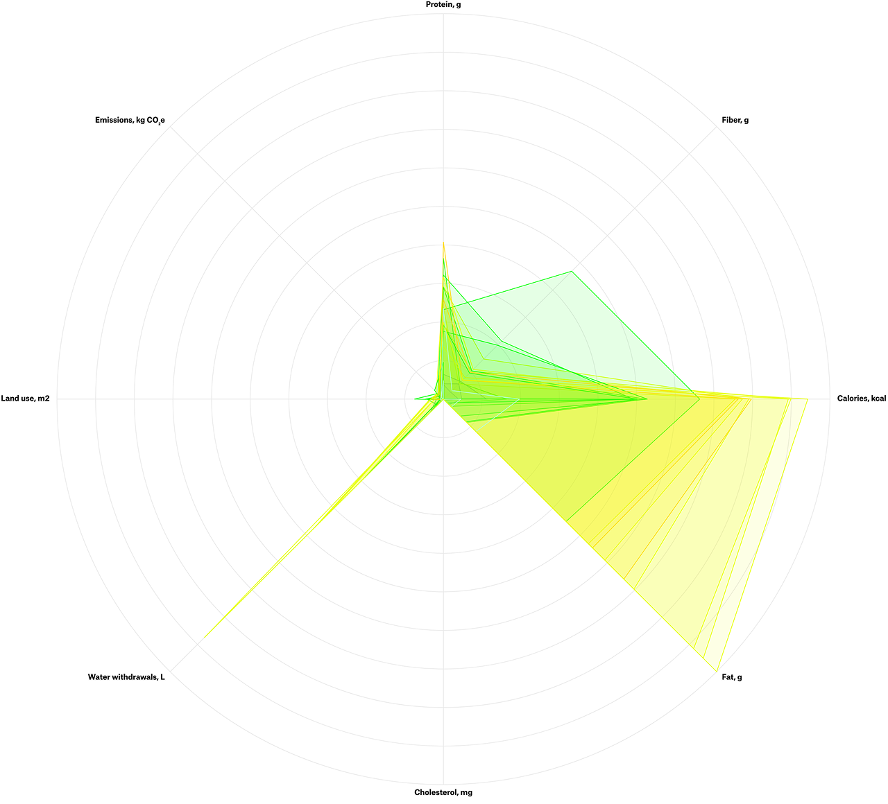
A radar chart model presented a convenient way to broadly cover both the nutritional qualities and the environmental production costs. With eight axes equalized for a 100g portion, several variables can be showcased in different scales of measure and proportions, colored by category.
On the right side of the circle were listed all the nutritious qualities. On the left are the environmental costs: use of land for production, and water withdrawn in the process. Lastly, the protein, chosen to conduct the study, was displayed at the top of the radar.
On the right side of the circle were listed all the nutritious qualities. On the left are the environmental costs: use of land for production, and water withdrawn in the process. Lastly, the protein, chosen to conduct the study, was displayed at the top of the radar.
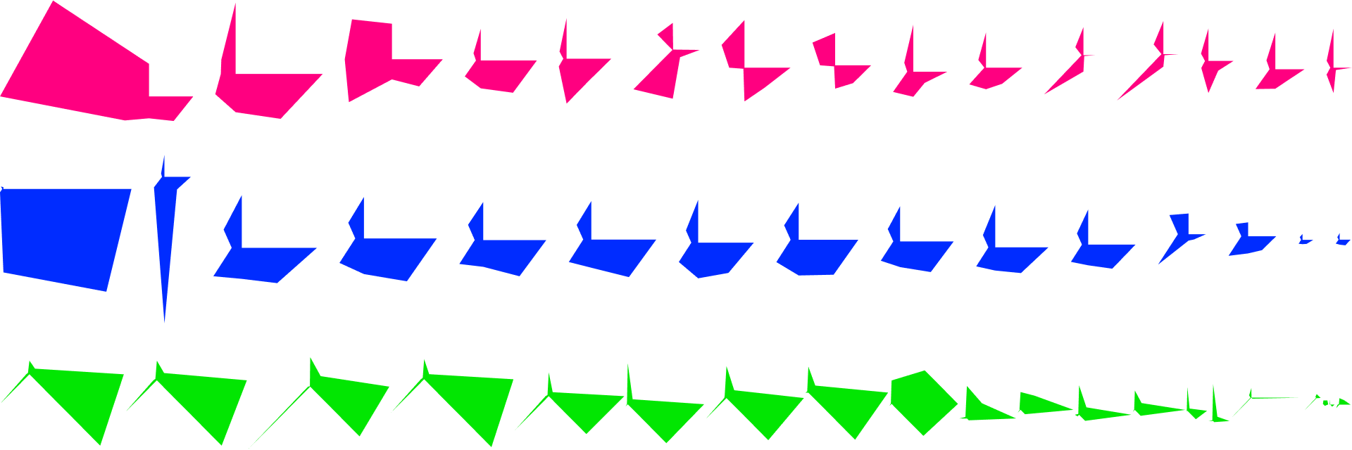
The extensive view of all the polygons side by side reinforces the patterns observed in the radar view.
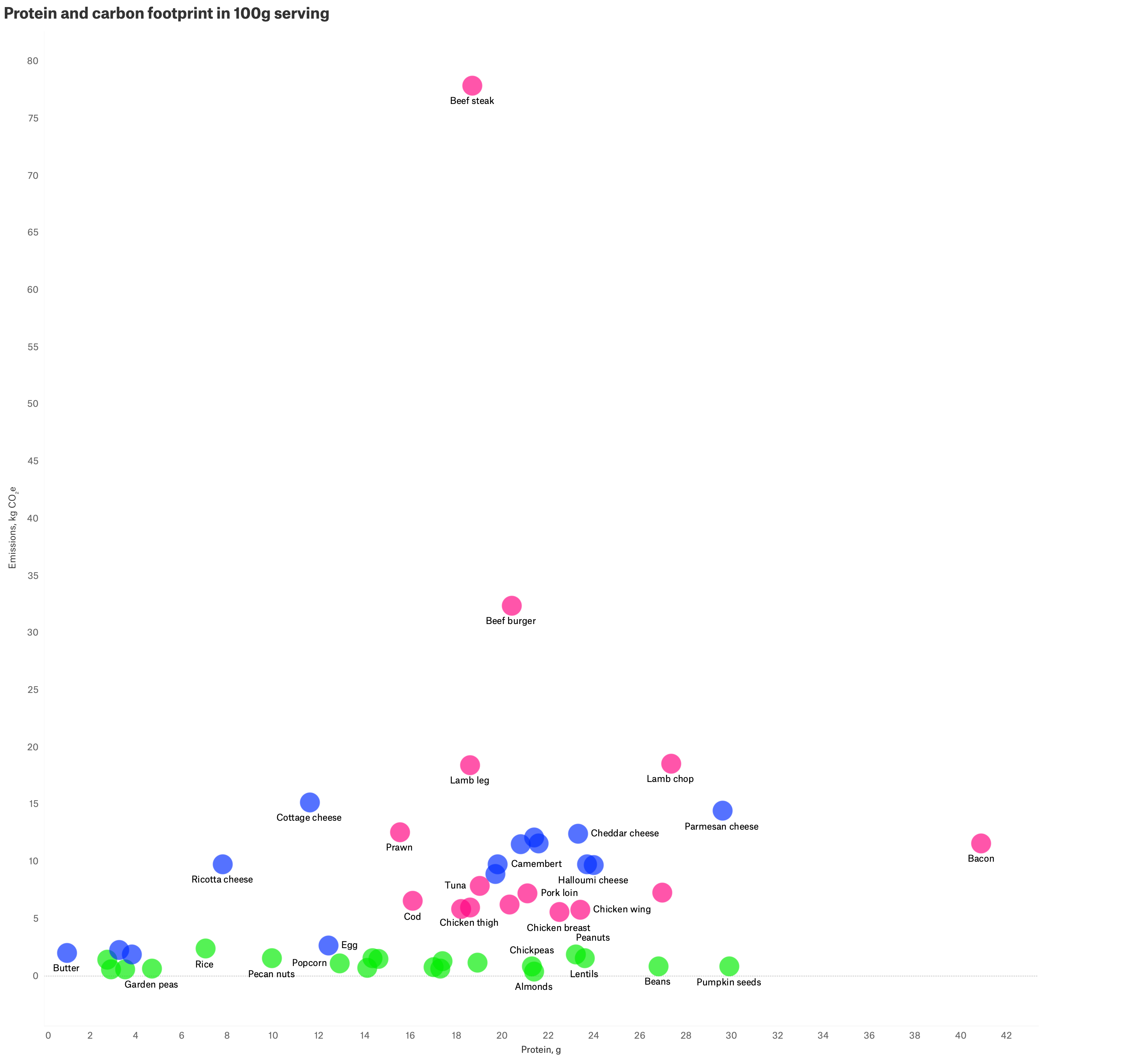
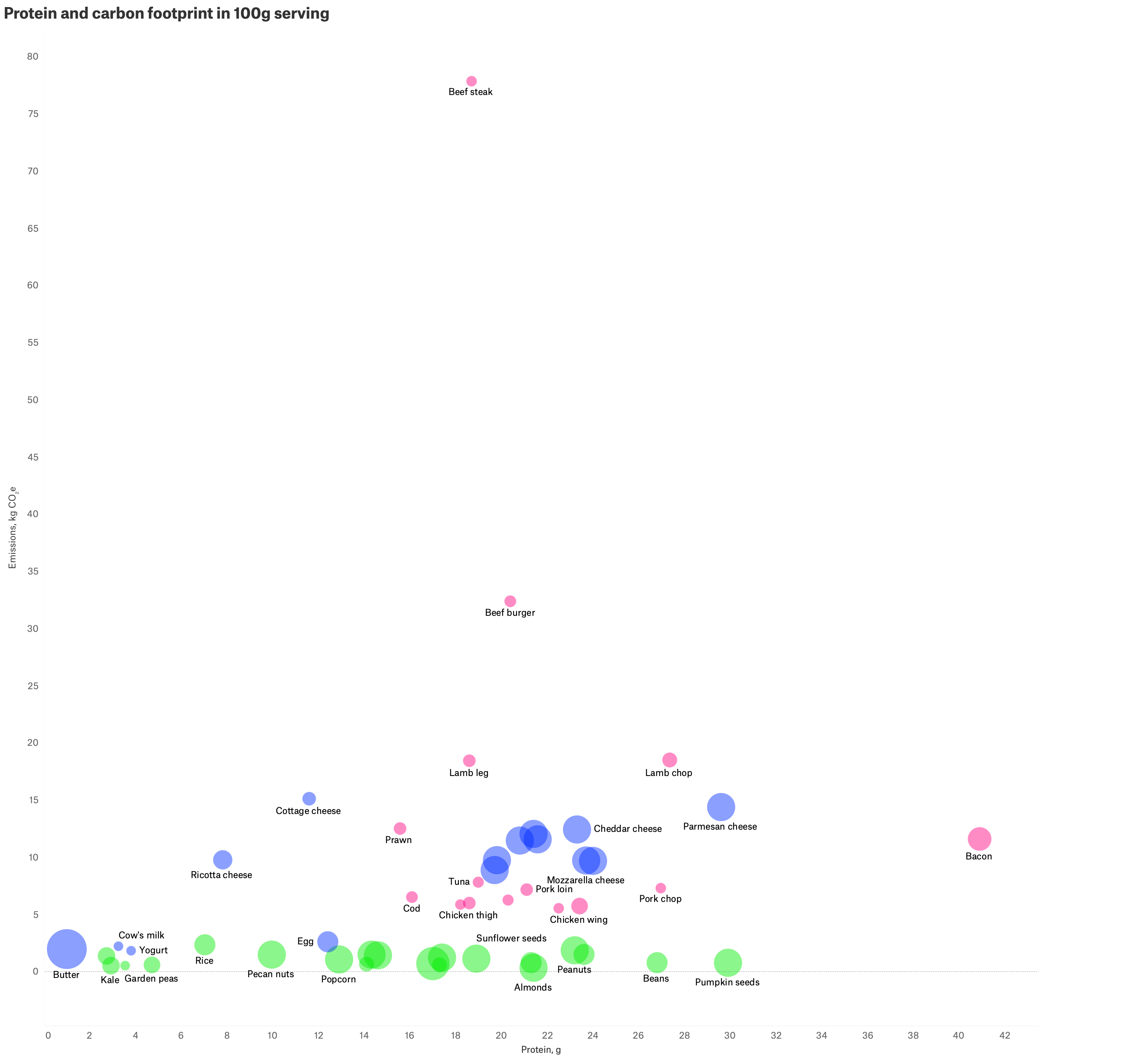
Another way to demonstrate the relationships among various attributes of food was to print scatter plots. This type of chart enables it to incorporate colors and sizes to the points along with the two axes variables. While the protein and the categories were consistently on the x-axis and color, the other factors were switched in the y-axis and size.
The first chart adopted the carbon footprint as the y-axis, while the plot diameter represented the number of servings within a 100g portion. Plot size follows the same pattern: animal-source foods cluster into visibly smaller circles than dairy or plant-based ones, since far fewer servings are needed to reach a 100g portion of meat or fish than of plant proteins.
And the second showcased the nutritious qualities of protein and fat grouped along the two axes, represented then in the same manner, while letting the carbon footprint be illustrated through the diameter, a distinct design element. Differentiating the categories by color revealed standards, highlighting the high contrast of the environmental cost among them.
The first chart adopted the carbon footprint as the y-axis, while the plot diameter represented the number of servings within a 100g portion. Plot size follows the same pattern: animal-source foods cluster into visibly smaller circles than dairy or plant-based ones, since far fewer servings are needed to reach a 100g portion of meat or fish than of plant proteins.
And the second showcased the nutritious qualities of protein and fat grouped along the two axes, represented then in the same manner, while letting the carbon footprint be illustrated through the diameter, a distinct design element. Differentiating the categories by color revealed standards, highlighting the high contrast of the environmental cost among them.
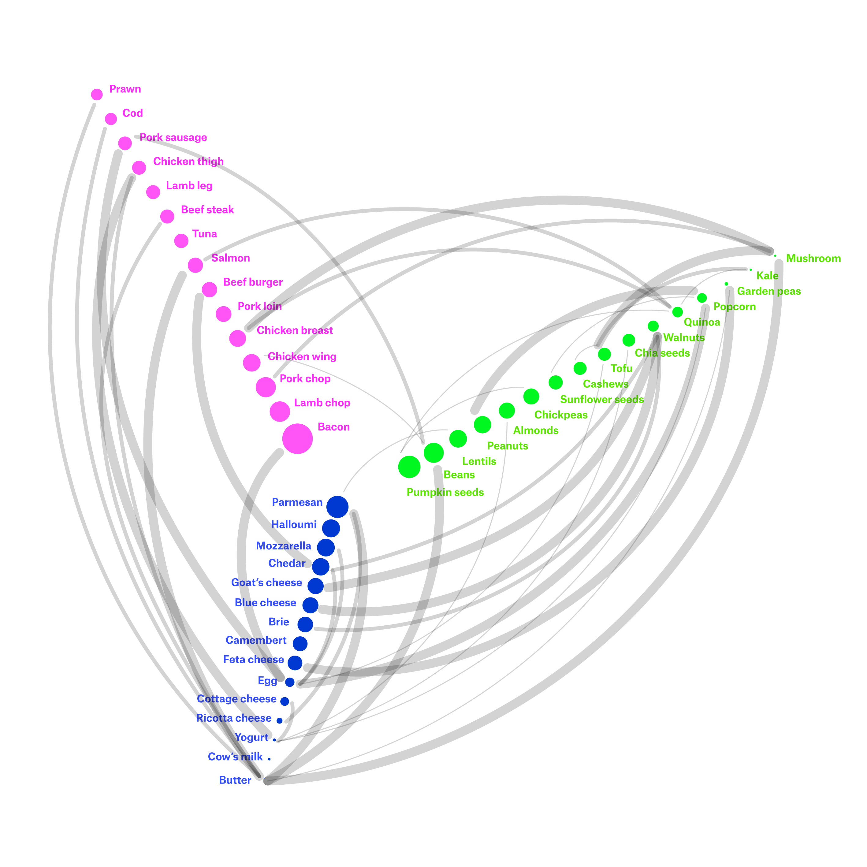
The network graph served to generate classic and nutritionally meaningful pairings within the 50 foods studied, focusing on creating well-balanced, high-protein meals. It connects pairs of nodes that represent the foods, illustrated by their images, through edges colored by the mix of the categories' colors, with thickness proportional to the level of connection — strong, moderate, or acceptable.
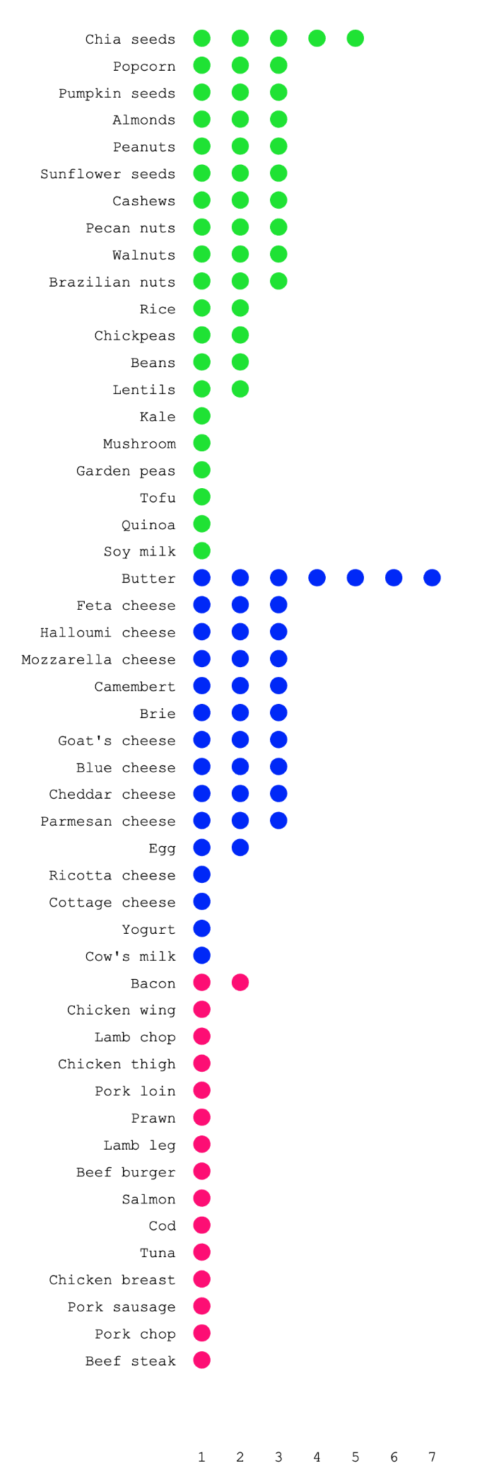
Bar charts were adopted in the format of the unit progress bar. In this case, they represent a limited number of portions: the amount of typical servings within 100g of weight. The goal of working with portions was to better connect with how people consume food.
This suggests that a holistic decision may consider multiple related factors. A typical portion of beef steak, for instance, despite causing an extremely high cost to the environment, is enough to provide a good amount of protein. The same gap shows up in the bar lengths: animal-source foods top out at just a few servings per 100g, while dairy and plant-based options stretch across noticeably more, showing how much more of them it takes to reach the same weight.
Sources
USDA
Our World in Data
This suggests that a holistic decision may consider multiple related factors. A typical portion of beef steak, for instance, despite causing an extremely high cost to the environment, is enough to provide a good amount of protein. The same gap shows up in the bar lengths: animal-source foods top out at just a few servings per 100g, while dairy and plant-based options stretch across noticeably more, showing how much more of them it takes to reach the same weight.
Sources
USDA
Our World in Data